Case Study

dana bates

The details

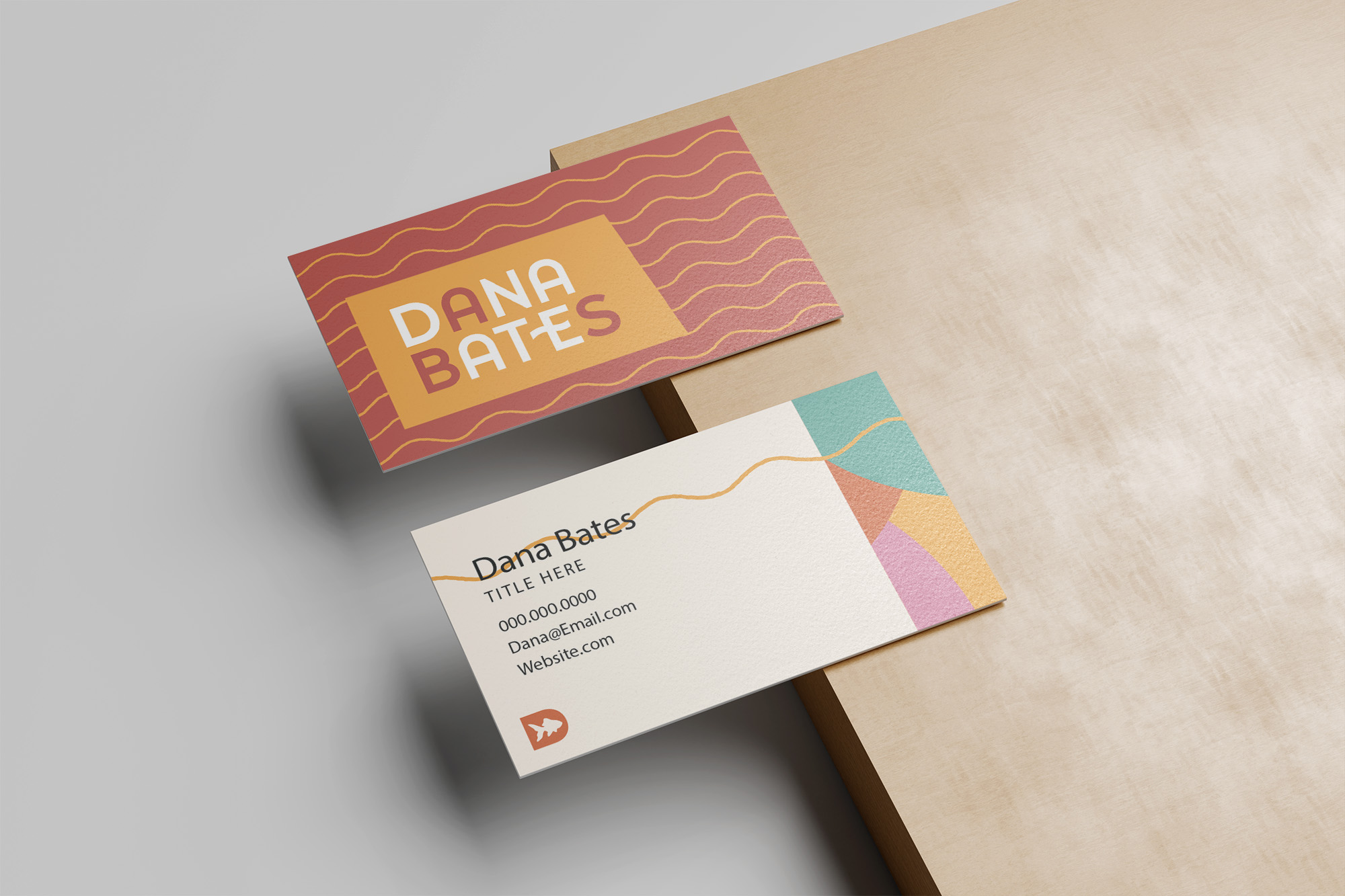
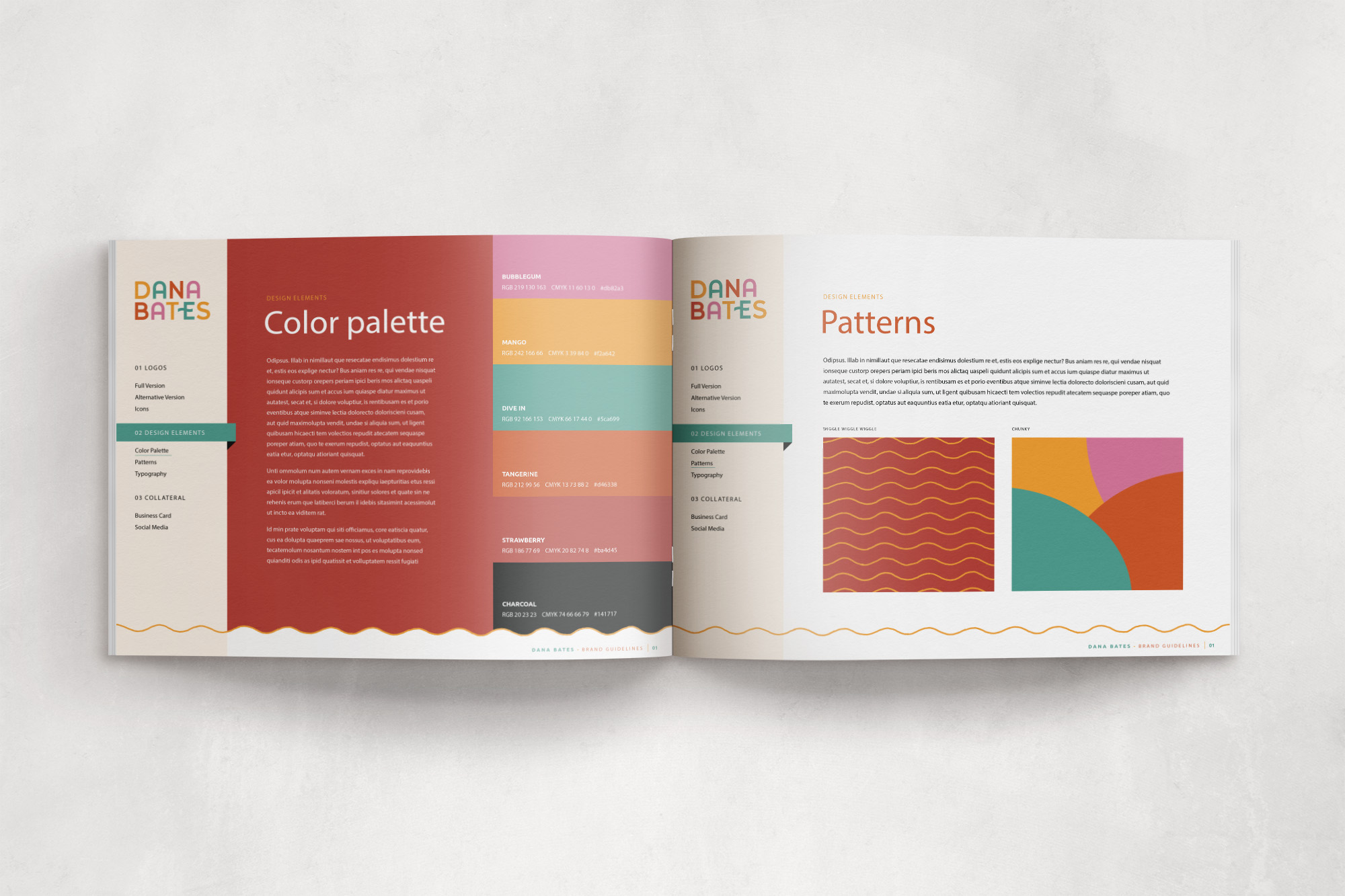
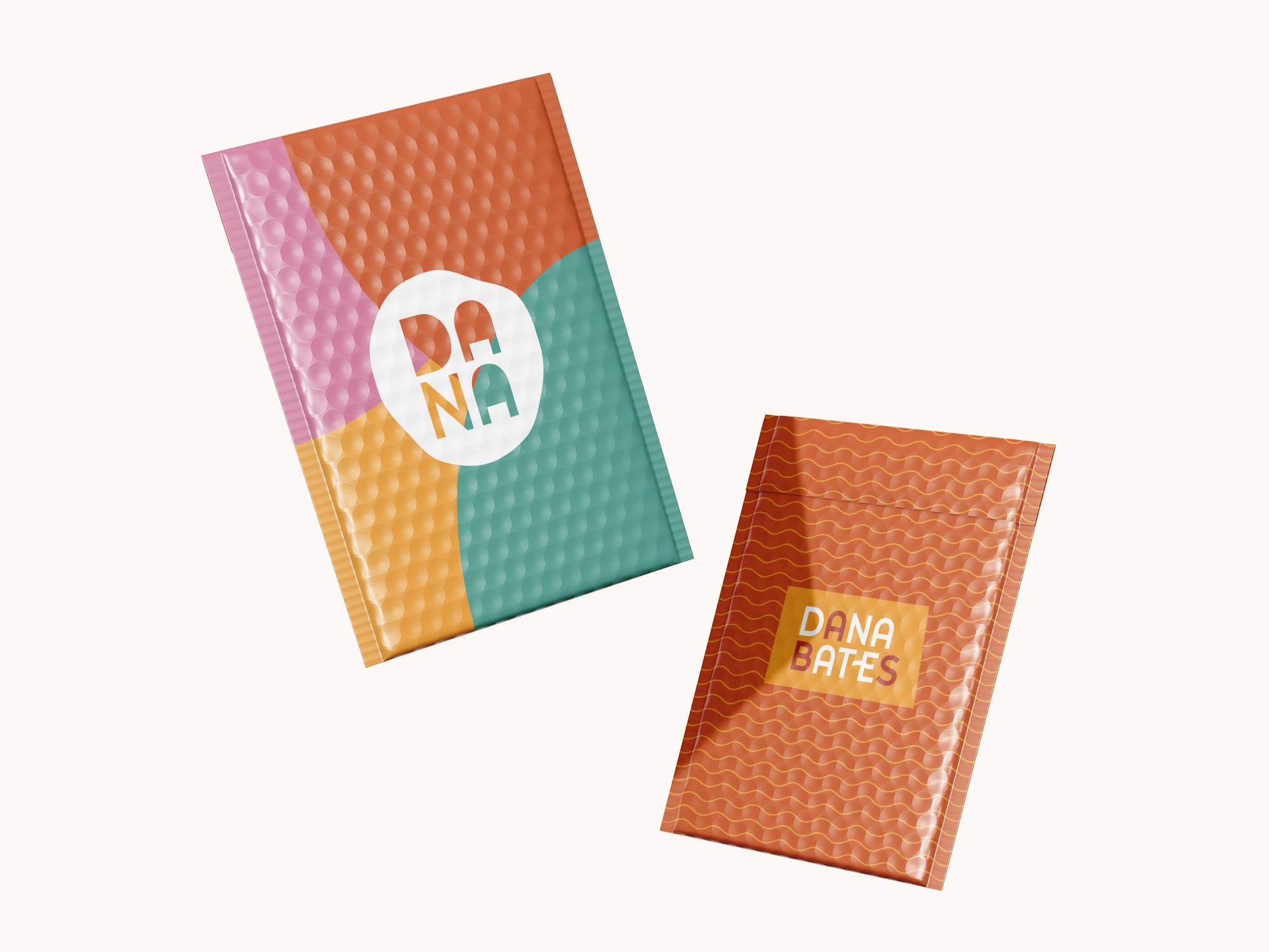
Dana Bates is bonkers in the best way… so obviously her brand had to be, too! Truly a dream client, this author gave us some incredible inspiration to work with.

The end result is a quirky, dynamic brand that incorporates every aspect she requested. The icon was inspired by her pet goldfish, which are a huge part of her life. We had endless fun with this!

A set of business cards for Dana Bates is displayed on a wooden surface. One card features a colorful, geometric design with waves and warm tones, while the other showcases a minimalistic design with clean typography and contact details.
An open brand book displaying the color palette and pattern design elements for the Dana Bates brand. The left page showcases a selection of vibrant colors with corresponding hex codes, while the right page highlights various patterns used in the brand identity.
A mockup of two branded mailer envelopes for Dana Bates, featuring a bold color palette and modern design patterns. One mailer has a patchwork-style design with a white circular logo, while the other features a textured orange background with wavy lines and the Dana Bates logo.

Because you 100% Deserve It
let's meet up »

this time it’s for you, foxy

STRANGE