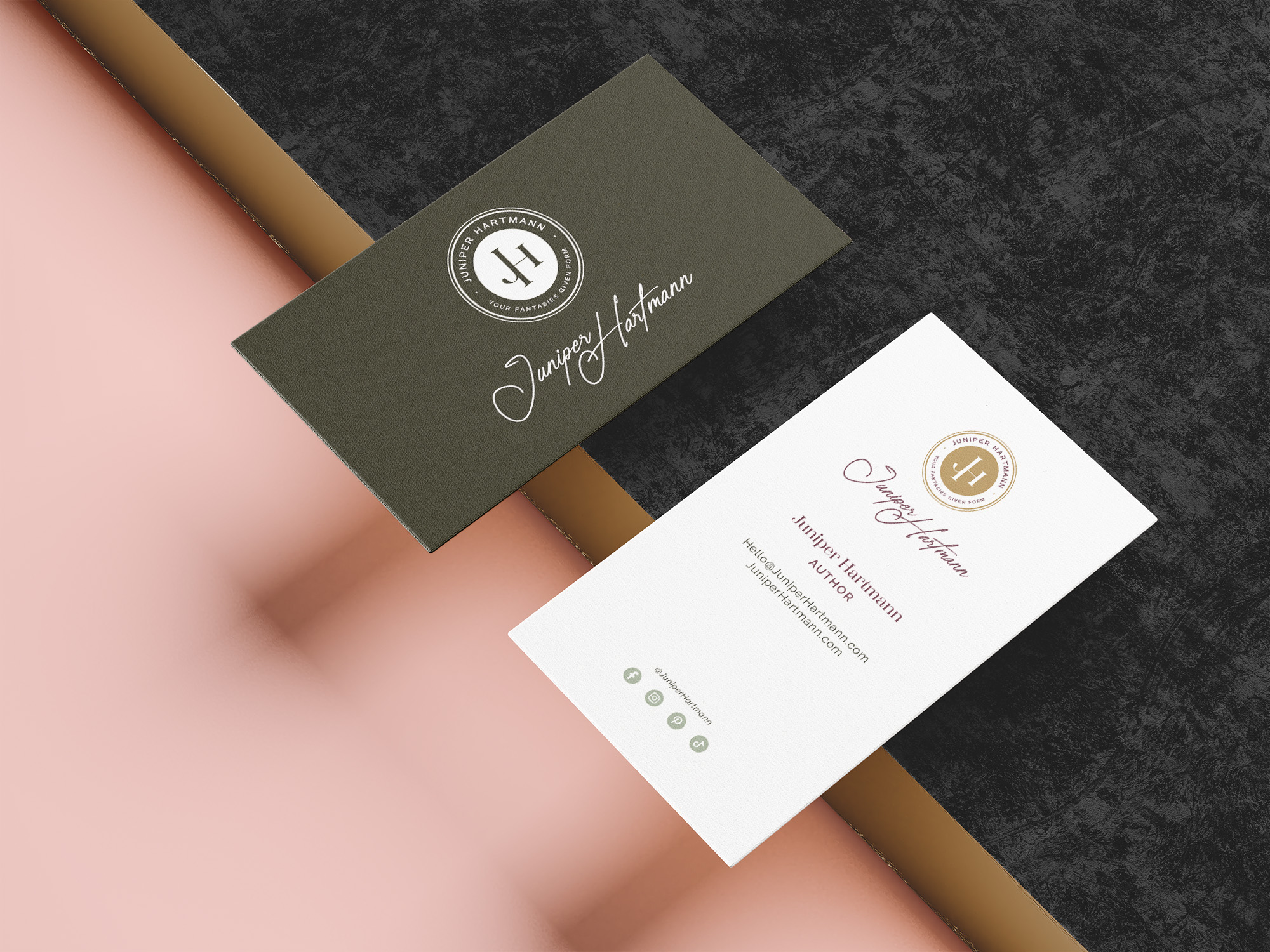
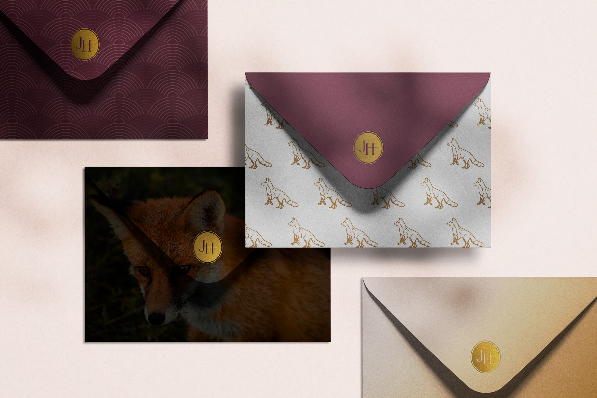
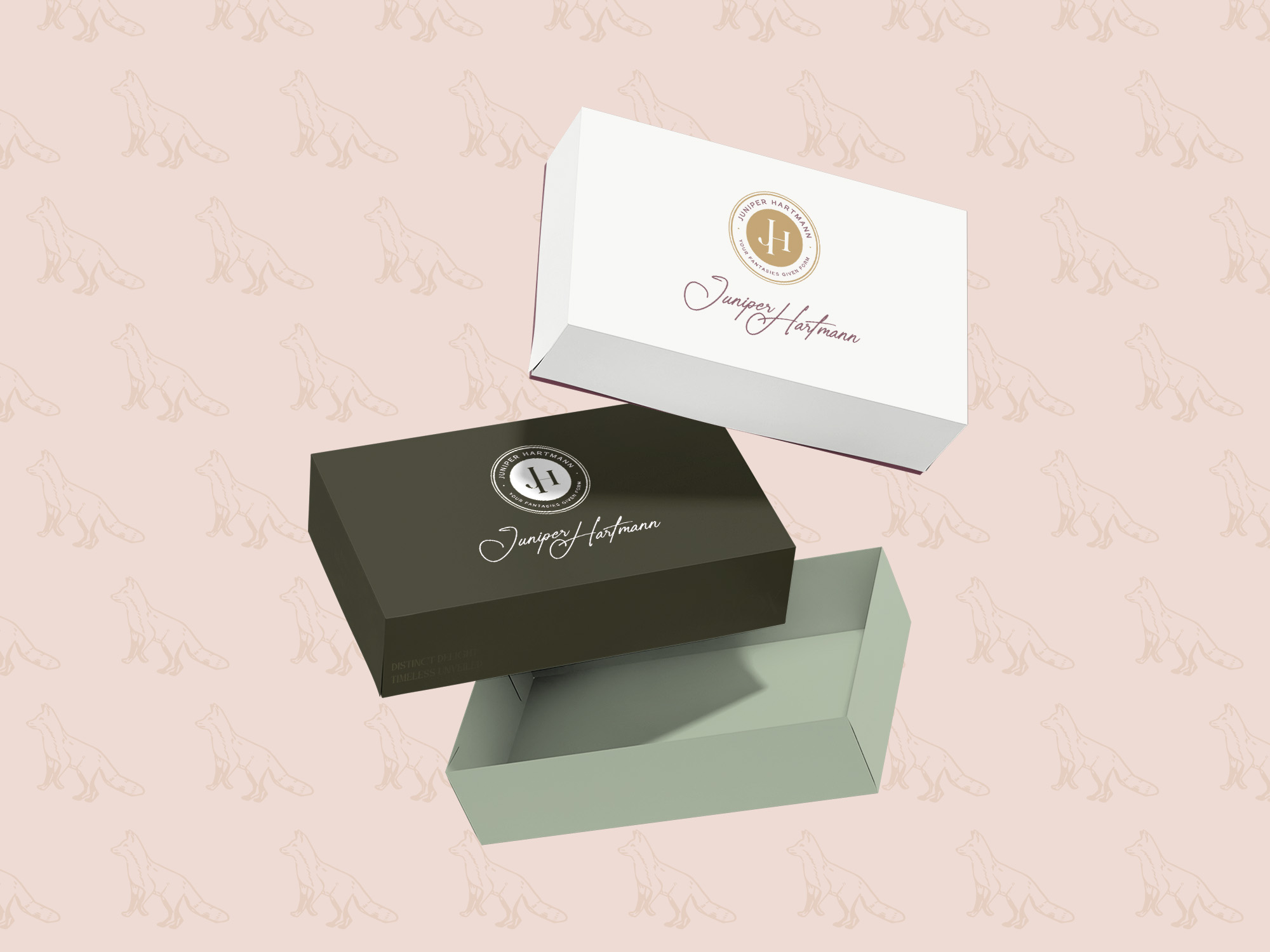
Juniper Hartmann was in sore need of a logo facelift to better represent her brand. She wasn’t sure what she wanted, but with the help of our creative team, magic was made.
Her emblem has always been the red fox. Because of this, we focused on instilling an “Old English” vibe that connects to the roots of what this brand is about. The fox is a known menace in England… and Juniper is a known menace everywhere else. Just kidding! Mostly. In the end, we went for classy, refined, and timeless. I think we hit that mark spot-on.