Case Study

Marron Kaye

The details

Marron Kaye is a client who had a firm understanding of where they wanted their brand to start. We were more than happy to assist in seeing her dream come true. Scroll to see more from this project.

Crafting Marron’s logo was as easy as breathing. She wanted Nordic, feminine vibes. We hit the nail on the head. We were inspired by Nordic imagery, keeping things simple but informative. The arch promotes a sense of grounding while the rounded top softens the design.
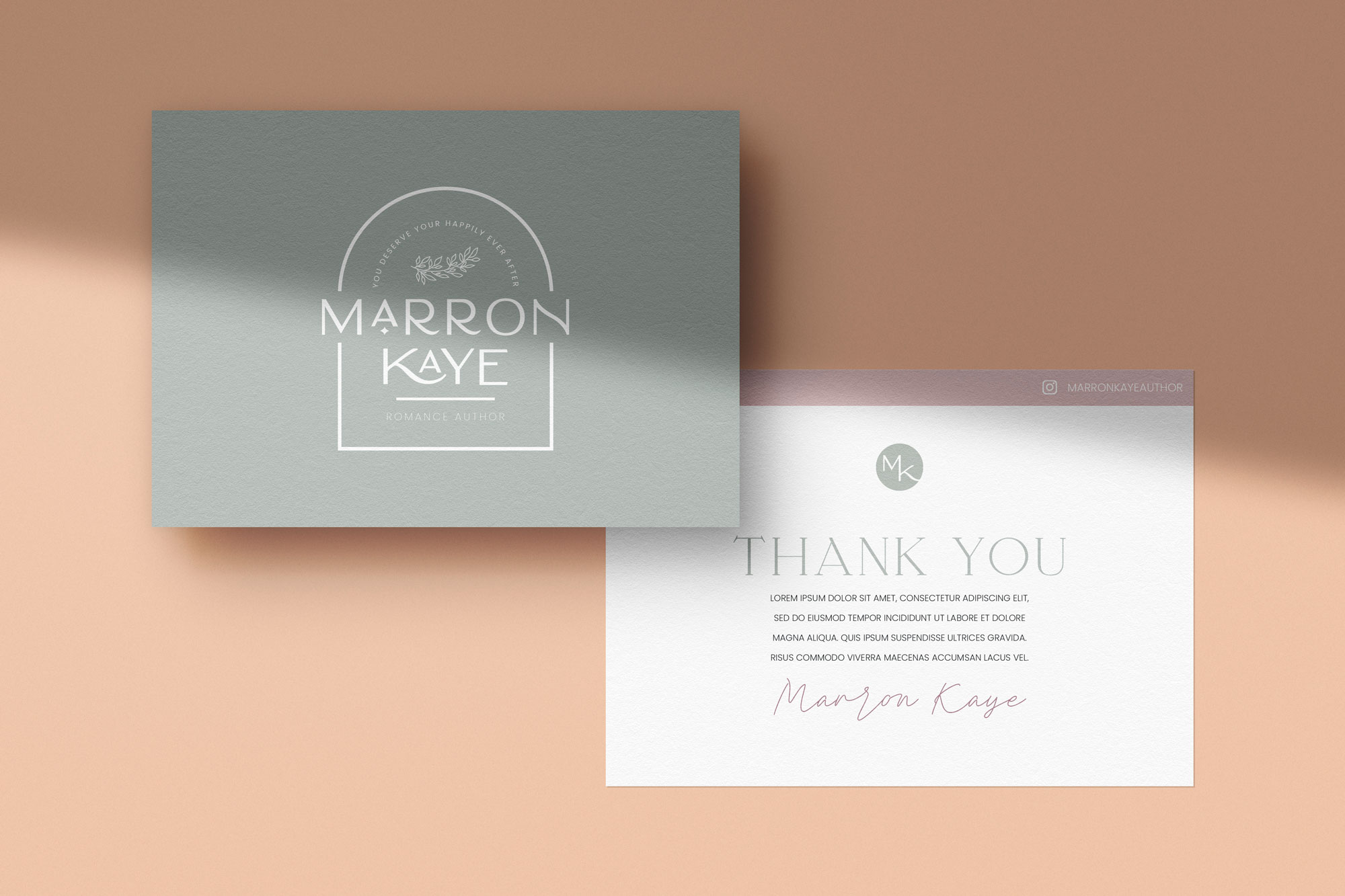
A flat lay of two thank you cards featuring the Marron Kaye branding in soft green and muted blush tones, placed on a neutral-toned surface.
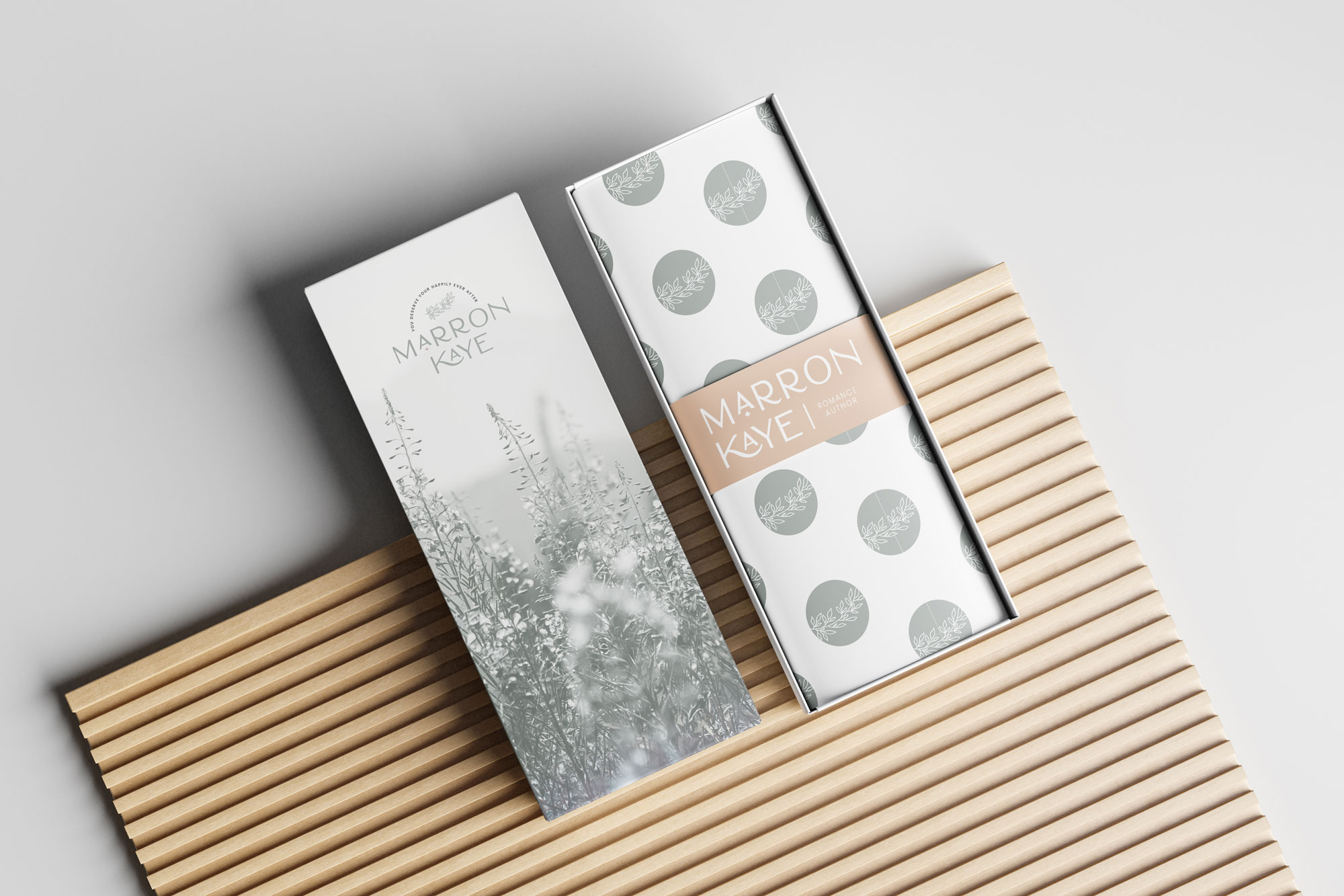
A packaging mockup displaying a sleek and elegant gift box with the Marron Kaye branding. The box is opened, revealing custom-branded wrapping paper inside.
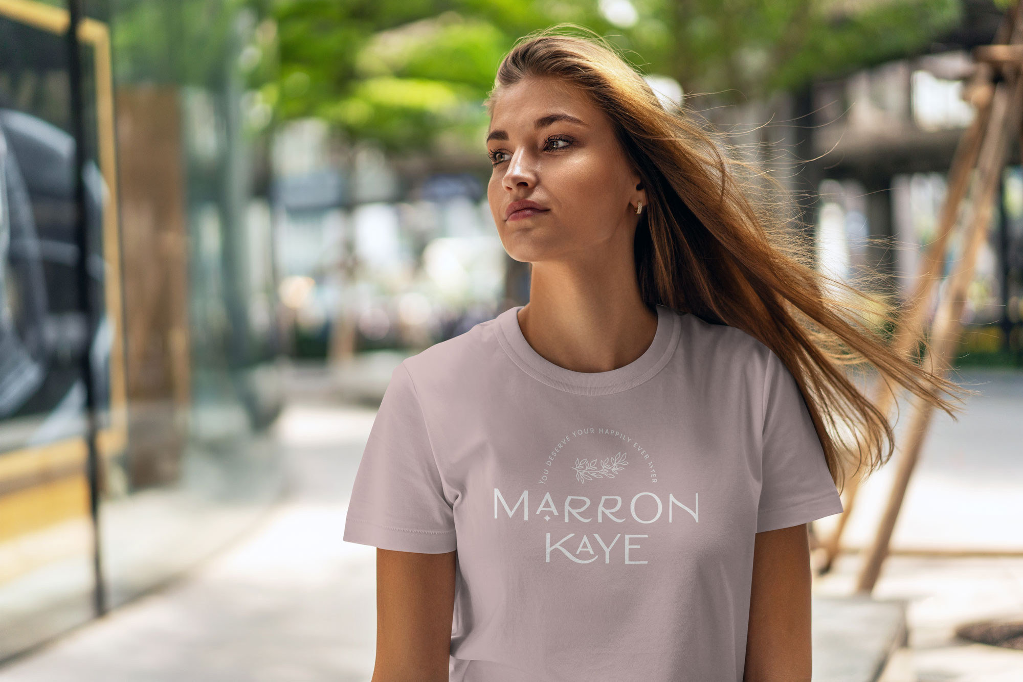
A young woman wearing a light-colored t-shirt with the Marron Kaye logo, walking outdoors with a confident expression.
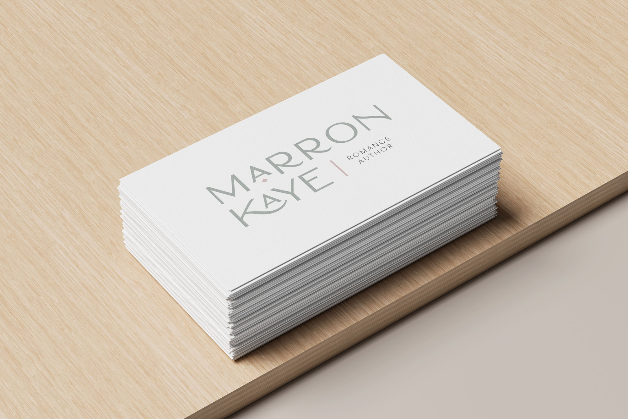
A neat stack of white business cards displaying the "Marron Kaye" logo with soft green text and a minimalist design.

Because you 100% Deserve It
let's meet up »

this time it’s for you, foxy

STRANGE